THE WORK IS THE PHILOSOPHY.
SIX WAYS OF FINDING BEARINGS
Visual identity is where meaning becomes visible. The challenge isn't simply to make something distinctive. It's to find the idea, character and point of view underneath the surface, then give it an expression that people can recognize, remember and use.
The challenge was to understand what Invest Vancouver needed to mean—not simply what it needed to say. The work looked for the idea that could connect its role, its audience and its ambition in a way that felt clear and credible. This campaign was launched to coincide with the FIFA World Cup Games played in Vancouver in 2026, targeted to potential FDI opportunities.
The starting point was to understand what Nova North needed to become and what it needed to leave behind. The work focused on finding a clear idea that could give the organization a stronger sense of identity and direction.

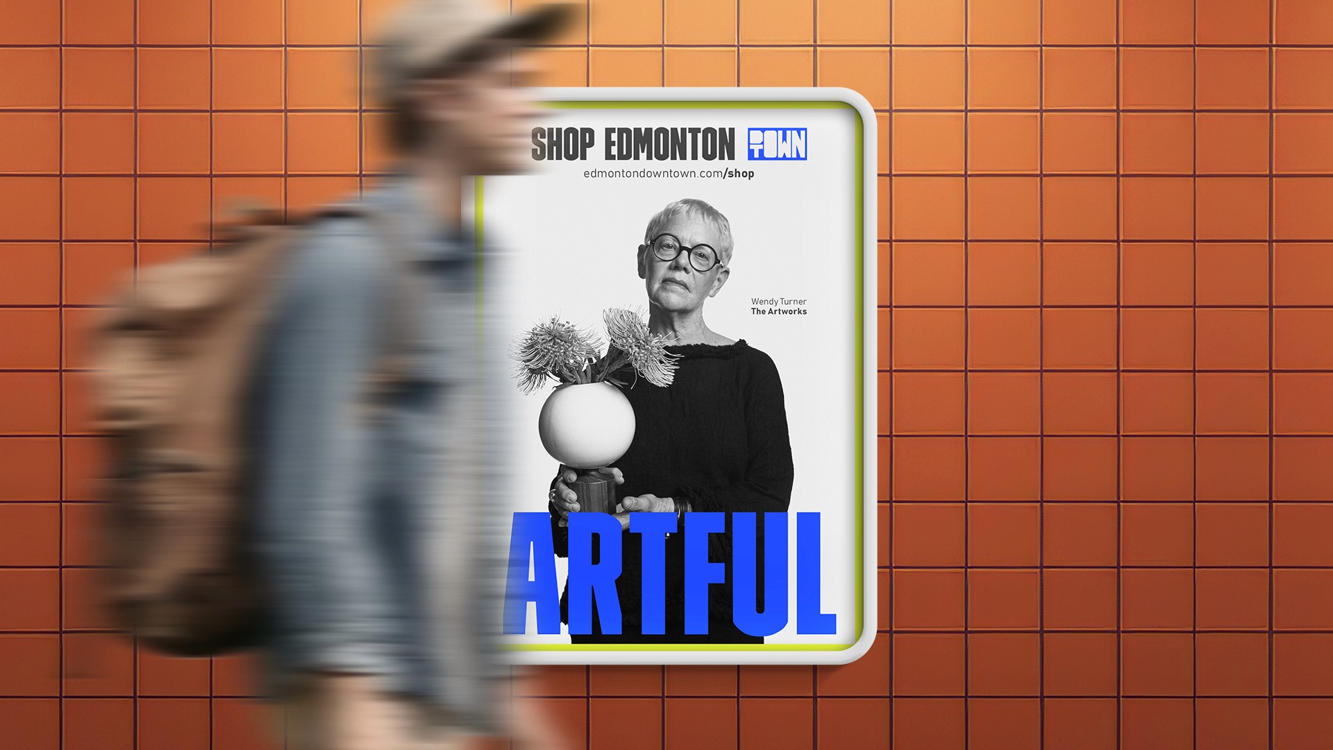
The name itself suggests a centre of gravity: the place where different forces, ideas and possibilities come together. The first challenge was to understand what that centre should mean and how the identity could make it felt. The project showcased those who championed Edmonton’s downtown—the OGs and the new retailers who champion and shape what truly makes a city brand.


The identity needed to hold more than a corporate proposition. It needed to connect economic possibility with the history, culture and continuing future of Cold Lake First Nations.

The starting point was a deceptively simple question: how do you make something as familiar as financial services feel new? The work looked beyond the category to find an idea that could express ATB’s relationship with people, possibility and the future.
